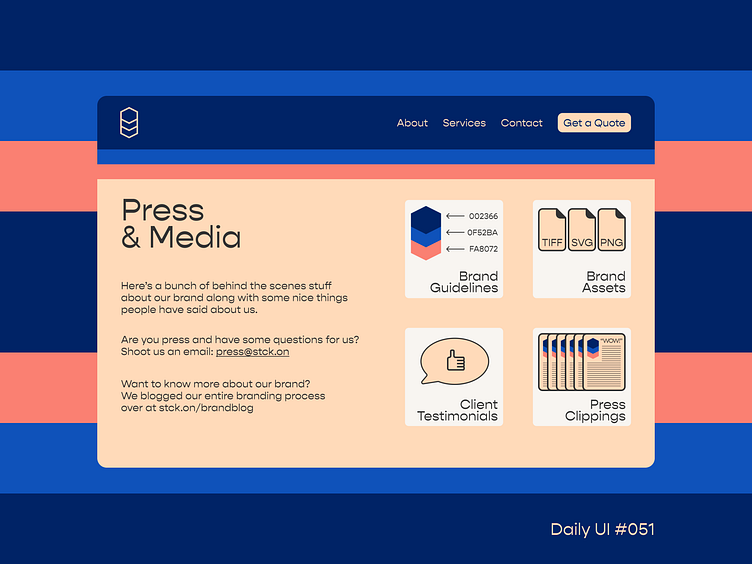
Daily UI #051
When presented with the prompt of "Press Page," I wasn't entirely sure what direction to go with. Is it a page for the press to come and get assets or reach out to the company? Is it "clippings" from different news or media outlets? Or is it something entirely different?
I decided to say "fuck it" and went with a combo; you've got your brand guidelines, assets, press clippings, and testimonials all in one place. Interested in learning more about the branding? You can check out the blog!
Nothing too crazy with this one, but fun nonetheless. Big fan of this color scheme and was finally able to use the font Gopher in a fashion that doesn't seem entirely out of place.
Like what you see? Hit the "L" and/or leave a comment! Always open to feedback!
More by Charlie Beck View profile
Like
