Moon Polish Branding


I loved beginning the Moon Polish mockup project – this was one of the more unique passion projects I’ve gotten to undertake and I hit the ground running!
PROJECT OVERVIEW:
“Our new nail polish brand is hitting the United States market in less than 12 months. Now that our non-toxic formula has been perfected, we’re in need of branding for our company including our nail polish bottles and other marketing materials to bring it to life. Our products will be sold in popular beauty stores, so we are focused on selling straight to the consumer.”
ABOUT THE COMPANY:
Founded by two best friends with a love for personal style, health-conscious cosmetics, and horoscopes, Moon Polish is a new nail polish brand featuring polish colors based on your Zodiac sign.
BUSINESS MISSION/GOAL:
“Your horoscope influences your personal style and beauty preferences, which is why we believe in helping you choose the perfect nail color that speaks to your inner soul! We also believe in only using the highest quality ingredients to avoid harmful chemicals and reduce our environmental impact.”
THEIR BRAND STORY:
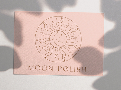
“We’re open to hand-drawn stars, or moon elements in our branding, but please avoid it looking childish. We would like to avoid loud colors, and instead, use colors that feel fresh like Spring.”
THEIR COLOR PALETTE:
I wanted to maintain the whimsical and carefree vibe that Moon Polish was founded on, so I chose brighter colors than I normally would
LOGO CREATION:
In keeping with the feminine and hand-drawn aesthetic, I chose a font that I thought brought a whimsical vibe. I think this brings a modern feel to this zodiac. I waved the primary and alternative fonts to provide movement throughout the branding. I wanted to keep the sun and moon element alive in the logo and think this main logo brings the best “zodiac” vibes 🙂