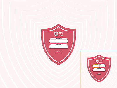
Label, input field, placeholder - UX design
Just a quick reminder even for myself, that input fields should not be something users have to think about. When using standard placeholders place a label above that specific input field, because more often you'll find that your clients are not filling them properly, mainly because they forgot what that specific field is used for. A label is always present and describes the function of that specific element, furthermore enabling blind people to "see" and navigate through your website.
A lot of us are typing in large forms using the Tab button. Don't restrict this capability from them. It's crucial and it saves time, by not needing to grab a mouse every time.
Lastly please don't ever let that happen, what I illustrated in the right bottom corner. When someone clicks on your input field, remove the placeholder and let him type in his words! I stumbled upon this lately and it completely staggered me. It was even inside a time limited event, so I really couldn't be bothered by this basic principle of UX design. Please please, I know almost every framework does this for you, just make sure it's not happening right now to you.
Have a nice day :)
If you have any suggestions or ideas about what I just said, please write me in the comments. I would really like to see some discussion.
Matej
