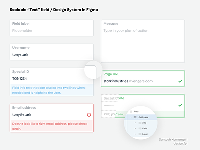
Design System - Text field - Figma
Having worked on Design Systems for the last 3 years and extensively on B2B side, a sense of "clear" UI along with direct feedback and "clear" UX has improved. Trying out a way to include common elements in a Text field -> Label, Value, Info + extras in a consistent way.
Would be interesting to try out how this style can be replicated to Checkboxes and Radio buttons?
Would love to hear your opinion.
Especially on the point "Is it already too late with such UI and have we entered the Glass & 3D phase already?"
More by Santhosh Komaragiri View profile
Like
