New Vice Golf Wordmark Concept
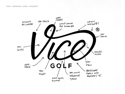


NOT ACTUAL WORK - As a little warm-up last week, I started each day working on what an update to the Vice Golf logo might look like. If you aren't familiar with Vice, they are a German-based direct to consumer golf ball and lifestyle brand. They have grown exponentially since arriving on the market in 2012. I'm not positive, but I believe this is the same logo they've been using since their conception. I feel like as their brand has grown, it could be time for the logo to grow up a bit as well.
These types of projects are some of my favorites to work on, as you have to make sure you're showing some restraint so you don't stray too far from the original design. I always start a rebrand like this with an audit of the existing logo. During this phase I'm simply trying to identify the inconsistencies and areas that can be improved upon. After the audit, I'll start sketching. This is typically done with some tracing paper and a pencil. I'm using the marked up logo as a guide during this phase. The goal is to work out as many of the problem areas before sending it onto the vector machine.
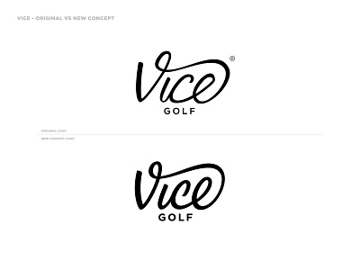
Overall I tried to make the letterforms more consistent and flow together better. I did add some overall weight to the logo, thinking this would allow it to be more legible at smaller sizes. I hope y'all enjoy the process as you swipe through the images.
There are lots of directions I could have taken this redesign, but like I mentioned above the goal was to just update the current logo by fixing some of the troublesome areas.