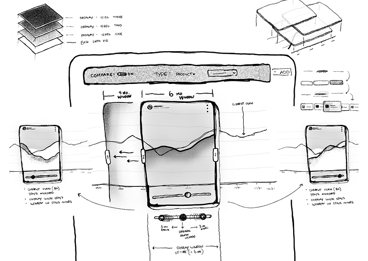
UI Wireframe | Data Visualization Overlay
Sketches from a data visualization feature I am working on. I used the @procreate iPad app to think through a few different directions and ideas. Not all great, but not all terrible.
One of the biggest challenges with this work is trying to figure out how to visualize both past and future (expected) data in a single view. I'd like to use the same chart but want to avoid confusing the user with multiple axis titles. That's whats pushing me towards a base chart with overlays that clearly sit on top of the base.
We'll see.
---------
Find me on: Instagram | Twitter | Behance | LinkedIn | Uplabs
More by Tyler Wain View profile
Like
