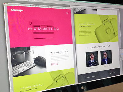
Orange Landing Page
Working on a very minimal landing page layout for Orange PR & Marketing. I've really been enjoying the opportunity to work on some user interface stuff as it's rather fun and refreshing :)
In terms of functionality, we weren't building this out for the user experience.. It's meant to show how we can use the split color treatment throughout the branding process as well as within the website/landing page. So before you get all excited and begin to ask how things are going to work make sure you read this :P There will be collateral stuff to follow. Happy Hump Day Dribbblers!
Photography: @alicjacolon
More by Focus Lab + Odi View profile
Like

