Chat
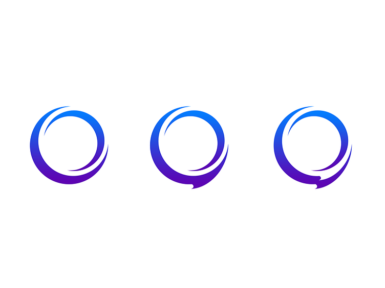
Some rejected logo concepts. The goal was to invoke the feel of the original logo – two crescents – while simultaneously conveying the chat theme. I was a fan of the third iteration, which is meant to look like an extruded outline of a chat bubble, but the company decided to go in a different direction.
More by Jay Moon View profile
Like
