Safari App Icon • Redesign
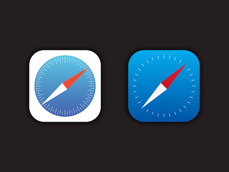
I'm currently working on a project to improve the iOS 7 icons. My approach is to refine and improve while being careful not to move too far from the original intent of Apple's design.
Improvements include: - elements across different icons more uniform - removing excessive details & clutter - soften eye-straining colors & gradients - subtle shadows to bring back depth
This is just a sneak peak. I will upload a shot with several icons later this summer.
Hope you enjoy!