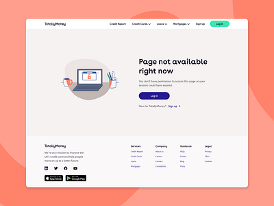
Error page layout design - across multiple types
As part of the rebrand for TotallyMoneys website we needed to re design the error pages. I created a layout style for the pages that could be repeated for all error types. At the moment the same layout is used for eight different errors, with variations on the images and copy. I've added four variants here.
For the pages our lovely illustrator Bali Engel did different types of accident and under construction scenes.
Programs used:
Figma
Photoshop
I would love any feedback!
More by Stina Slingo View profile
Like


