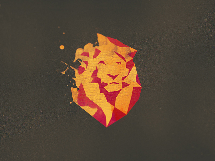
Bleon Logo
So we decided to go with this lion, and this shot is just an exploration on how to use just two colors on this logo.
This is more like and exercise to test the limits of this mark, that of course everyone claim that is too much (colors, details, etc) for an logo.
I'll post soon the 'one color version' that is basically this one without the yellow part and a more 'complete' red part.
Thank you all for the feedback so far, and feedback is still very appreciate guys!
More by Breno Bitencourt View profile
Services by Breno Bitencourt
Like

