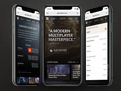
New mobile experience for dota2.com
Personal redesign project for dota2.com
A few months ago I've gotten back into Dota 2 after spending a good amount of time on it from 2012 to 2015. Relearning a lot of things that I've forgotten and/or have changed is quite the chore with such a complex game. The very few times I didn't rely on trial & error or the in-game context help, I've checked out the new Dota 2 website that relaunched relatively recently. What was pretty disappointing is the lack of mobile consideration with the website. While it looks good when viewed on desktop (which is - of course - their primary target audience), I thought the responsive aspect was overlooked and down-right dismissive of this use case entirely. I'm not advocating a mobile-first approach, but rather, with the available tools, to simply adapt to different screen sizes with relatively minimal changes.
So I made this as an exercise how Valve could simply transform their desktop oriented design in an experience that doesn't dismiss mobile users completely.
If you want to check out their current site, please do so at: https://dota2.com
Rules:
* Keep the current content/copy
* Keep the same feature set (this comes with 2 minor caveats)
* Don't change the layout too drastically
Regarding the feature set only 2 things changed:
1. I've removed the login feature from the site completely. I couldn't find any way of interacting with the profile in any way, so I figured: "What's the point?". This might be some hidden feature I couldn't find (in which case I'm sorry) or future-proofing for upcoming functionality. In this case I can safely ignore it with my current requirements in this fictional brief.
2. I've added another filter functionality on the Heroes page, that allows heroes to be filtered by Ranged or Melee attack type. I just found it neat.
Hope you find it interesting and let me know what you think! Check out the full screen view for more details.
Cheers.


