Real Estate Landing Page
💌 Have a project idea? We are available for new projects info@ronasit.com | Telegram | WhatsApp | Facebook | Linkedin | Website
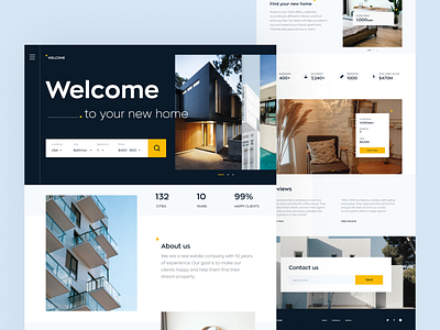
A landing page for an offline business is a digital business card and a marketing leaflet: it helps to increase brand awareness and promote it. Here's an example of a real estate agency's landing page from our design team.
The shot shows the main top sections of the landing page. It has an agency's short intro, the cons of choosing this agency, photos of the properties offered, and a contact button.
We selected a neutral color scheme that creates a reserved look. The contrast blue and yellow colors are used in the interface elements.
This landing page attracts visitors' attention by unusual typography solutions and animated interface elements that appear when scrolling. It also meets the requirements of an informative business page giving an overview of the agency's services.


