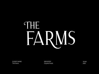
The Farms — Organic Foods Logo Design
The Farms is a brand that is home to natural, fresh, and certified organic food products. This specific packaging was designed for their Himalayan Pink Salt product that they sell in the U.S.
The new mark is a reflection of what The Farms stand for, that is to provide fresh, natural, organic, and premium products to the farmers of the modern world.
The serif and all-caps letterforms give a premium and modern feel to the mark. The arm of the letter "T" in the word "The" is curved from one end and the leg of the letter "R" is extended like a plant to give the mark a natural and organic feel.
These nuances result in a wordmark that is scaleable, bold, and yet elegant.