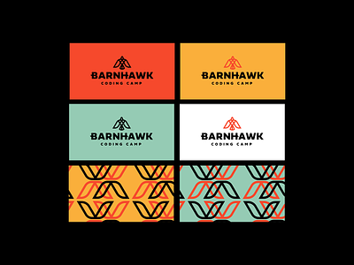
Barnhawk Logo Business Card Design
Honestly, I made so many bird logos when I was working on another client I decided why not use one for a passion project. Here are some rough business cards I've created for a coding bootcamp called Barnhawk. I've customized the typography to include little wing-like features on the bar of the H and bowl of the B. I wanted to use a color scheme that was bright, energetic, and bold. The red has ties to the barn aspect, yellow for cheerfulness (students excited about learning) and green for growth. I utilized the wing-like features from the type and logo to create an offset pattern. What do you think? Keep going?
More by Kevin Craft View profile
Like
