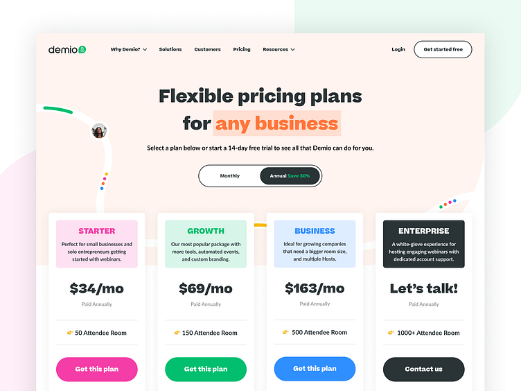
Demio Pricing Page!
Pricing pages are one of the essential pages of a marketing site. Every start-up will have different goals that need to be accomplished in a noninvasive way - i.e., not directing the user to pick the most popular plan. There's a clear and bold toggle at the top to select monthly or annual.
Our goal with the Demio pricing page was to express a plan for any business that wants to create a webinar. If the audience is unsure, we have multiple CTA's to sign up for a free trial if they haven't already selected that from one of the other core marketing pages.
Each plan has an assigned brand color associated with it with a matching CTA color as well. We used emojis to draw more attention to the room size, as each plan has a max room size before you need to select the next tier.
We added an FAQ section to help clear up any questions they may have before signing up to reduce customer service time.
Here's what Demio had to say about working with us: "Brass Hands did an incredible job supporting our marketing team by creating beautiful, easy-to-use brand guidelines consistent from social cards to our website. They even helped us transition their website redesign through continued support during and after the project. Their help allowed us to focus on messaging to our ICP, not bogged down in design details we were ill-equipped to handle in-house."
Let's work together! Email me at kyle@brasshands.com
