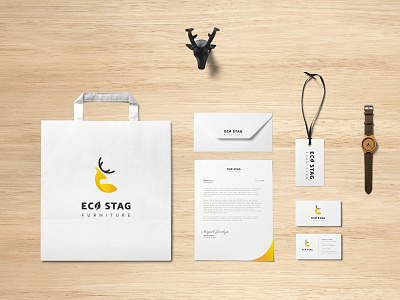
Eco Stag Furniture
Role: Visual Designer
Timeline: 2 months
Tools: Adobe Illustrator, Adobe Photoshop
What is Eco Stag?
A Furniture company based in Norway, prioritizing solutions that help the people, while taking care of our environment, with a modern and minimalistic style.
Why the change?
Eco Stag is a furniture company based in Norway. Their sales numbers recently have been dropping, and their visual style is very disorganized, has no unity, and is long due for an upgrade.
The Process
Research
To begin off the research process I started gathering information about the industry, the products and services being provided by Eco Stag. Conducted a competitive analysis, in order to learn what has worked and what has not in the industry. Additionally, to see what opportunities that creates, and what threats other companies create. The companies I looked at were Ikea, wayfair, and Inside weather.
Ideate
After having gathered knowledge, and good understanding of the industry, and the feeling the company is trying to portray, I started sketching out ideas for the logo, and thought of some basic color schemes, and typography.
Develop
Using the sketches I created earlier, I choose 3 best ones to work on and further develop. Picked the best one and the one matching the theme of the company as the final product.
Logo
From the sketches I picked out 3 main ideas to work on, and eventually decided to pick one of them and commit more work towards and finalize its look.
For the color scheme, I Looked at the meanings of different colors and found yellow representing creativity, enthusiasm and clarity to be surprisingly well aligned with the style and mission of the company.
Next, I worked on the typography, mockups and patterns for the brand to finish up the project.
Revise
Lastly, I went over a few minor revisions, proofread all the text, and fixed all the mistakes that were left. With that I completed the visual redesign of, now Boston Pint.
Thank you
for tuning in!
