Risk Analysis Dashboard Design
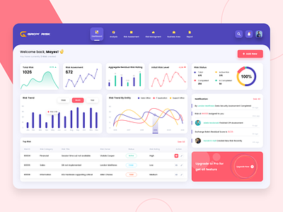
We are super excited to share our risk management dashboard to better identify, monitor and manage risk efficiently.
Here we have presented key numbers, charts and content in a straightforward manner so users can navigate easily. We highlighted important information like risk level and risk trend in intuitive graphs that help users to read the data at first glance.
The dashboard uses a very clear layout, a deep blue color scheme with white background which creates a visually attractive dashboard design.
What do you think about this design?
We are so happy to hear your feedback and let us know. 😊
Tools: Adobe XD, Adobe Illustrator
We’re available for new projects! Drop us a line at biz@cmarix.com or https://www.cmarix.com/inquiry.html#utm_source=Dribbble.
—
Press “L” and shower some love.
Want to see more projects? Visit our profile and remember to follow us!
