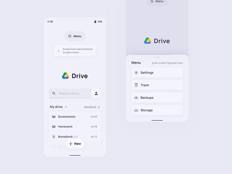
Google Drive Redesign Exploration Concept
Yo! Had a conceptual idea about Google Drive mobile app design using slikker design principles.
I want to make mobile layout more reachable by moving interaction elements to the bottom of the screen, getting rid of bottom navigation bar (user can tap accidentally on element close to the edge of the screen while using phone with one hand), and adding gestures.
There is also a case study on behance! :)
I hope you like it! I'm always open for feedback and critique :3
More by Oleksii Besida View profile
Like
