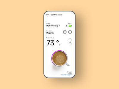
Smart Coffee Cup Dashboard UI
I went into an exploration of typography. After I realized how easy it is to convince different segments of a design by a little change of font size & typeface. In this "smart coffee cup dashboard" UI, I've just used only 4 font sizes & 3 typefaces. So, it became really clean, minimal & easy to understand UI.
Show me your ❤️ & feedbacks.
Thanks!!!
More by Nipun Koshalya View profile
Like
