Organdy / Brand Identity


I recently posted the Organdy animated logo shot. Here's the rest of the brand identity project. You can see more if you're interested: https://www.ephraimjoseph.com/work/organdy
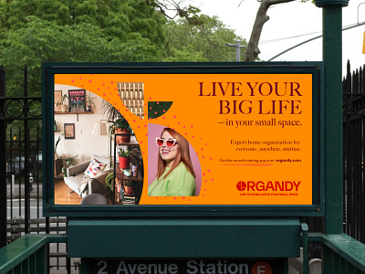
Organdy makes home organization accessible and affordable for everyone, anywhere, anytime. An organizer will consult with you virtually at your pace to create a custom organizing system that takes the stress out of living your big life in your small space.
I crafted a brand identity that resonates with hip city professionals who want a professional organizer to help them bring order into their homes. I helped create the brand strategy and visual designs to evoke a energetic and warm vibe for Organdy. In the logo design, I'm using the 'O' in Organdy to represent a space or home. The space is reorganized, as illustrated in the logo animation below, to create a tidy circle. The negative space in the circle/avatar represents shelves. The shape elements that make up the circle are used as visual devices that contain things like photography and texture accents to create dynamic looking layouts. I organized (pun intended) everything into an easy-to-follow brand book to help my client adhere to the brand’s look/feel/tone guidance.
