Tokopedia Product Icons - Belanja
Hey, how’s it going? This time, we made some refreshment on category icons - the ones you’ll see when browsing cool stuffs on Tokopedia.
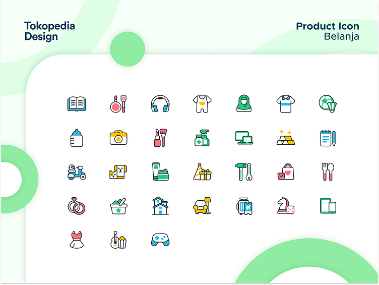
We use black for outer line to make the icon shape clearer. The line itself is thin, so the users can see more detailed shape of the icons.
On treating each icon, we choose colors that can be best to represent their object & context. Lighter colors are also preferred to make it easy to see, even for people with color blind.
We’d love to hear your thoughts in the comment, or visit our Instagram @tokopediadesign