ESPESO - Branding

As part of a school project, ESPESO was created as a fictional brand for the traditional Mexican Atole drink. In contrast to the Atole's origin and its current reputation within Mexico City, our approach was to boost its image and improve its existing social position as part of a selective lifestyle. Likewise, the drink was classified as a product at the same level of high quality coffee and tea and its target ranged from 16 years to older people with a taste for something healthy, nutritious and tasty.
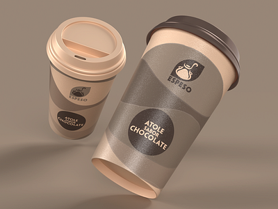
The brand name ESPESO, comes from the same Spanish word that means "thick", which I chose with the intention for an easy evocation from the public, also being an adjective that is usually used to describe the drink. With that in mind, I defined the color wheel with sophisticated themes that accentuated the sweet, creamy, and concentrated appearance of Mexican desserts.
The logo represents a ladle serving Atole from a traditional clay pot alongside the brand name at the bottom. The result aims to convey the texture, taste and smell of the Atole, as well as evoking its essence (a product made of corn) to distinguish it from other similar hot-drinks.