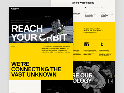
Space Machines Company Website
The new Space Machines Company website is designed to be informative and educational rather than convincing and salesy, showing that they don't just have a vision, but a strong plan to get there. We also focused on building credibility by providing more detail about the team, investors and partners behind the company.
The overall site is designed to be a "lean back experience" - we wanted to remove as much navigational thinking as possible for the user. By removing CTAs in favour of a more scrollable / passive experience, the goal was to increase time on site and make the site feel more narrative driven.
Read the case study
More by Jellypepper View profile
Like


