Space Machines Company Typography
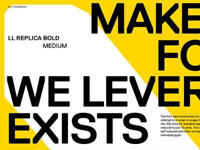
Essentially, it's the balance of human and machine, the "ingenious machinist", where we pair bright and energetic colours like yellow and orange with a unique geometric headline font and typographic layouts.
For the typeface, we chose Replica as it's strong character creates the foundation for the entire direction. The typeface feels engineered and technical, but it’s brutalness is offset by warm, high-contrast colours.
Read the case study
More by Jellypepper View profile
Like
