Jewelry Store App (Cartier App Redesign)

The team is available for new projects! Drop us a line: hello@purrweb.com | WhatsApp | Website
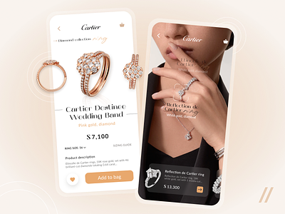
Hey-hey! Welcome to our recent attempt to redesign a Cartier Jewelry Store app. Online store to buy jewelry accessories 💍
On the left side shot there is product card with a description, price and the ability to choose the jewelry size 🌟
On the right side — product search by photo with the ability to go to the product card 🔎
The accent color is gold — to support the idea of selling jewelry. Gold is considered the color of health, optimism and vitality and helps users relax. Symbolizes the shade of mutual love and forgiveness 🥰
Additional color beige — matches the skin colors of the models and black — the color of luxury, sophistication.
Using this app people can search for the product by uploaded image ✨
Press L if you like our design and share feedback!
P.S. If you want to gain insight into UI/UX design trends, check out our article.
Created by Alexandra Bessonova