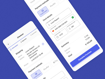
Payment page
The checkout page is one of the most crucial elements of a good user experience, a bad design can make your user run away and never purchase your product or website.
Here are a few things that you can do in order to improve your conversion rate:
1. Show the user where he is in the shopping process with steps and guide your user
2. Provide the contact details and shipping address on the payment page and avoid the user browsing the previous page
3.Avoid having too many mandatory fields, you can always ask for information post-purchase
4. Use trusted logos like Paypal, Mastercard, Visa...
5. On mobile, have a feature to scan credit and debit cards to avoid the user putting all of his information if it's a first-time purchase
It's also important to provide different payment solutions, here I've decided to put the more common payment solutions in the first positions, the logos also reassure the users that the payment is safe on your website so don't hesitate to use them.
