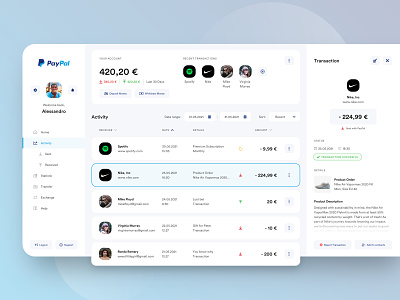
// PAYPAL ACTIVITY FEED// UI Redesign
The other day I lost a bet and as a man of honor I had to pay my debts. So what do I do if there's no cash? Exactly, Paypal! The first choice for most people that want to quickly send an amount from A to B. So here we go... I open my macbook, go to www.paypal.com and here I am... Being welcome by the same boring site im used to… for so many years. So I asked myself... Maybe it's time for something new? So I quickly took the challenge and made my plan to create a simple look & feel of "How i would recreate PayPal". True to "Principle first" I gave the interface a facelift, added Icons and a proper visual hierarchy and used the whole viewport for the interface. Long story short, check out my PayPal Redesign Concept and tell me what you think.
I've recorded the design process. You can check it out on my YouTube Channel!
Cheers
Note: Please feel free to give me critique/feedback on all of my work. I'm not fishing for any kind of compliments by posting designs that just dont work in reality. My goal is to become a better designer and to learn from you all!
