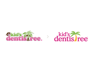
Brand Refresh | Kid's Dentistree
The goal with this brand refresh was to make the logo more versatile, remove the monkey (obviously) and generally create a more appealing brand mark. Mandatories included using the same type family (Cooper) and salvaging the palm tree icon. Although just about anything would have made this update a success, I'm excited about the new style.
More by Jake Stephenson View profile
Like
