Sign-Up Page
Hello fellow dribblers!
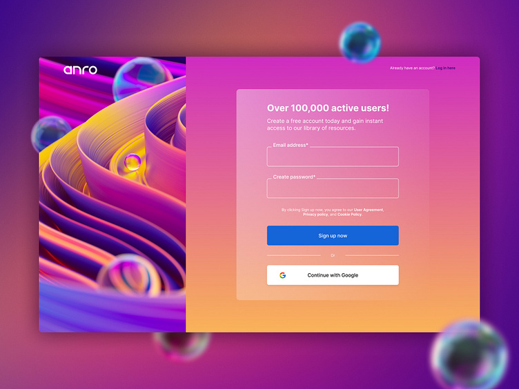
This is just a simple sign up page for a fictional company.
In many cases, the signup page is the last step in a business’s conversion funnel. It’s where prospects navigate after they’ve evaluated a brand and decided its service offers what they need.
Because of that, signup pages should focus less on persuading the prospect to convert and more on minimising the friction involved in doing it.
Creating a successful signup page is about more than eliminating distractions and reducing form fields. To generate maximum signups, you have to minimise the steps involved in registering, and at the same time, make the most of the few elements you use.
Here are some of the key UI/UX elements and theories I used to create this design;
A benefit-oriented headline
I was able to keep it simple yet still felt there was room to reinforce my USP with a headline. As they say chances are it’ll have a more positive impact on conversions than negative.
Making all fields required
Keeping only what is essential for sign up as a field, reducing anything that has no purpose at this stage. The less work they need to do, the better.
With this is mind I removed common fields such as username, separate first and last names, and confirm password as this field is outdated and only necessary because of password masking.
Instead of making the users click a checkbox stating they agree to your user terms, I have included a message above the CTA. It states that by converting, the user automatically consents.
Social autofill
Having a continue with Google link allows users to bypass the form with a single click by importing relevant personal information they’ve already submitted.
Formstack found that by including this feature, users were able to generate 189% higher form conversions.
Leaving out the placeholder text
Users need to know how and what each form field is for but using placeholder text isn’t always the best way to show them.
has the potential to:
Strain users’ short-term memory. Make your form fields invisible. Irritate users tabbing through the form. Confuse visitors.
To avoid any confusion, I have just included a label above each field that tells visitors exactly what they need to include in it.
Thanks for viewing. Let me know your thoughts below and anything you would do differently. 💫
