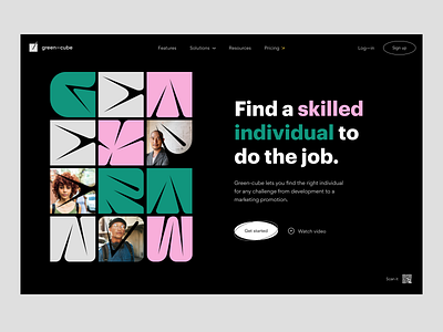
website: landing page
Hi folks! Here's a little something special to start off your week.
So, I've recently found these free fonts here and among them, I spotted SK Quadratica created by Darya Cherevkova. I had this idea of working around a blocky font to create a pattern for a website's header.
Any thoughts? Let me know in the comments.
_______
do you think we're right for each other?
More by OOZE View profile
Like


