Greenshot Logo Reimagination
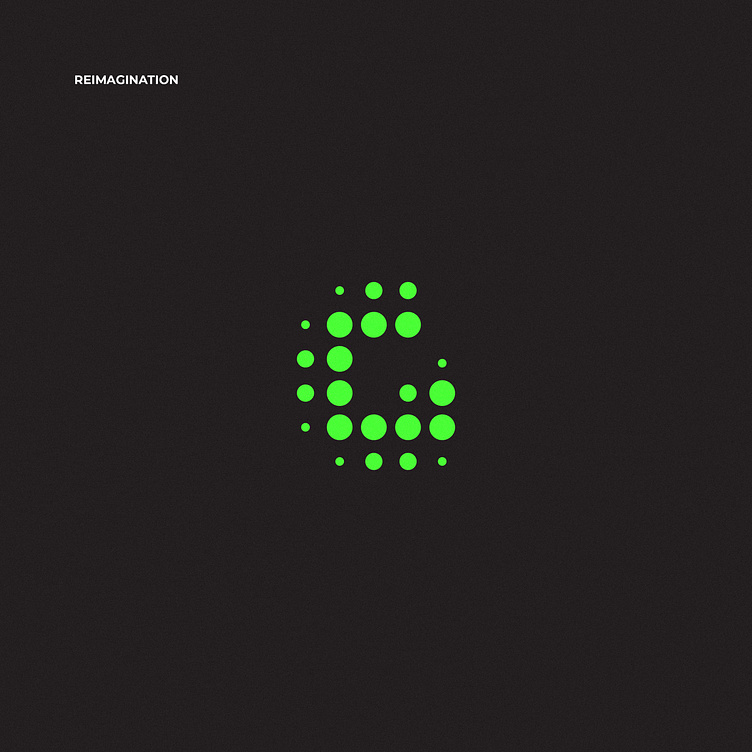
I recently installed Greenshot on my windows, and the icon kicked off to an idea for logo redesign for the app. While the current design works perfectly, I thought there were room for improvement.
I adhered to the original concept in this case, so I won't be pouring out the symbolism here. I darkened the background for better contrast. Since the name suggests green, I had no other options but to keep the green. But I played with the hue a little bit for fun.
In my opinion, a centered composition serves better than a tangled, cropped-out one, so I changed the angle too.
