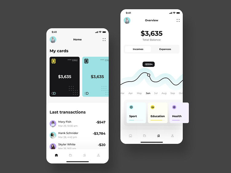
Bank app screens
Happy Friday!
I am a big fan of bank apps. Now I want to represent a very uncommon idea that I used for one of my clients, but due to NDA, I can show it to you in a different concept. Look at this graphic line. It’s a piece of art. Do you remember that old-fashion Banking Apps which look terrible and super simple? Hah, me too. The worstest, that some of the European banks still have it, and people are suffering from “hello for 90’s design solutions.” I am here to change this. I want to break that paradigm and show you the beauty of financial apps as it is. Please enjoy and share with me your pains about your bank apps. Thanks for your comments and likes. I appreciate each of you.
Design — Figma Illustrations — Illustrator Animation — AE
************ 💌 I am open to new projects! hey@migulko.cz ************
