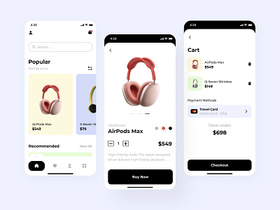
The Shopper mobile app design
Hey you all!
Please meet few screens from the new upcoming app for the e-commerce platform with updated user flow. All your favorite products are in few clicks. There is no need to drawn in the tonnes of catalog trees. Everything is around three levels of depth. Want to know more about an item? Popups will help you to get fast info and close it with the swipe. It’s a new experience - I was working on the mechanism of the user’s interaction with the app. So not only UX and scenarios but also the behaviors of the Target Audience were counted in this design.
If you want something like this, simply let me know by the “Hire me” button or direct message. I will try to help you.
Design — Figma
************
💌 I am open to new projects! hey@migulko.cz
************
