Learn how to create accessible and aesthetic interface #4
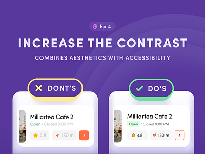


I want to prove that design can be aesthetically pleasing and accessible at the same time. Here's episode 4 where I took a random shot from Dribbble and improved the accessibility there.
Here you have 5 practical tips that increase the contrast of your design and won’t hurt the aesthetics of the project.
This series was created for the Linkedin carousel, so it has a square layout. This is not the full version, if you want to see more check out this post on LinkedIn:
https://www.linkedin.com/feed/update/urn:li:activity:6780451923905531904/
Cheers!
