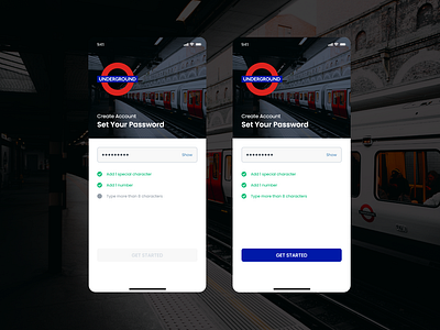
Create Account - Set Password
I tried to pay attention to some of the password field UX elements that often get overlooked.
A: There is some controversy regarding the "Password Eye" icon in the community [1]. Google's Material UI introduced the password visibility toggle icon. The closed and open eye states can be a frustrating [2]. Should the icon be the action that will happen after user clicks on it? ...similar to when a song is playing, the icon showing is “Pause” (future state), and when it is paused, the “Play” icon is shown. Some platforms also use a Checkbox with Show Password label, but that starts another debate between Checkboxes Vs Toggle switches, where toggle switches are better for instantaneous effect and checkboxes are often used where setting should be only changed after another button is pressed to confirm. Users expect a more immediate change with switches than checkboxes [3]. To avoid overall confusion and controversy - I have decided to use a Text button which will have Show and Hide states.
B: When a system has strict rules (often in case of setting password), we should inform the users about such constraints and give the level of compliance [4]. Some platform only show the error, if/after user fails to meet the criteria. It is not fair to punish users if they didn't know the rules. Password strength indicators are also a trend in UX, but again sometimes it lacks to show how the strength is being calculated, adding more confusion. Simplicity should always be at the heart of User Experience.
C: Password validation should be dynamic and the Call-To-Action button should be disabled until the criteria is fully satisfied. UCD should aim to save time and effort.
Want to share your thoughts? Feel free hello@kevsingh.info
References:
[1] -- https://thedistance.co.uk/uncategorised/the-password-eye-icon-nightmare/
[2] -- https://ux.stackexchange.com/questions/1318/should-a-toggle-button-show-its-current-state-or-the-state-to-which-it-will-chan
[3] -- https://uxmovement.com/buttons/when-to-use-a-switch-or-checkbox/
[4] -- https://cxl.com/blog/password-ux/
