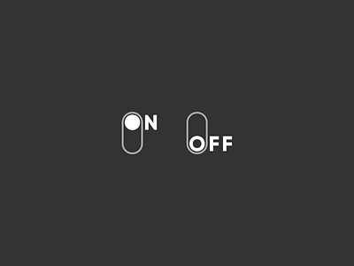
Daily UI 015 - On/Off Switch
In this Daily UI, I tried to make switch unique. In this design I made the O of the ON filled and empty for OFF. I made this design choice because I wanted to make OFF feel like it is missing something, something and that is present in ON state.
More by MirrorLeaf Studios View profile
Like
