Eco Design - Logo & Icons
Brand identity concept for an interiror design company.
The client works with lichen and moss, rendering beautiful concepts that serve as an interior decorative piece. Vegetal walls, framed compositions, logos, volumetric letters, wall watches, are some of his best-selling products.
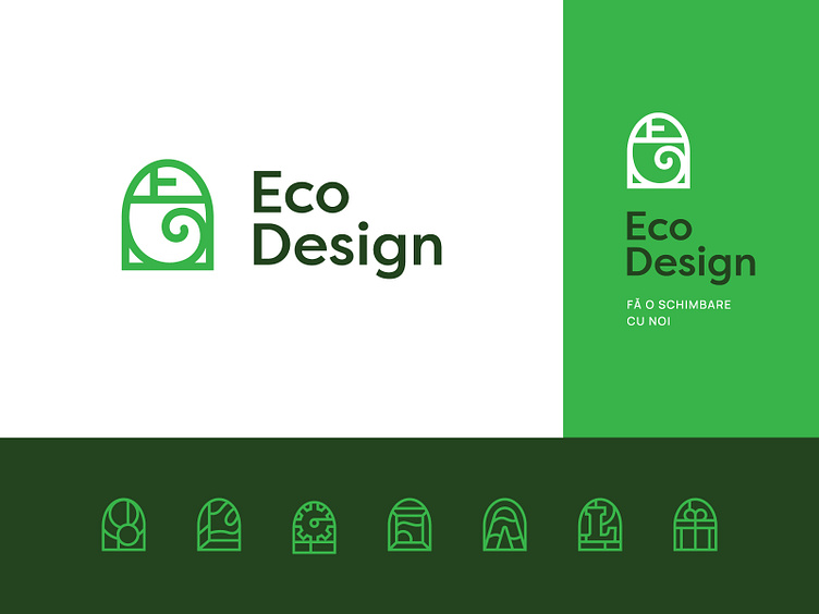
The symbol mimics an abstract chameleon shape, that also embodies the way different pieces of moss interact, suggesting the idea of constant change, the dynamic state of nature.
The symbols here suggest the main product categories, and their treatment is derived from the same monoline style presented in the brand mark, including the arched shape, reassuring a consistent visual language.
Do you see the chameleon? I find it rad!
The client went for a more descriptive approach, as this concept was too abstract.
Let me know what's your take on this one in the comments.
Have a great one! Cheers!
