eCommerce App
💌 Have a project idea? We are available for new projects info@ronasit.com | Telegram | WhatsApp | Facebook | Linkedin | Website
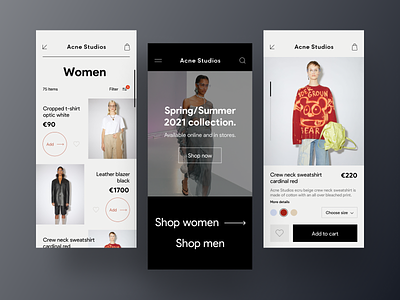
Designing a digital product for an established offline brand may be tricky. One should follow the set brand guideline but apply them to a different environment. Here's our experiment of how a mobile app for Acne Studios could look.
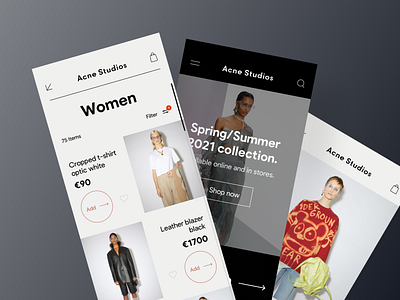
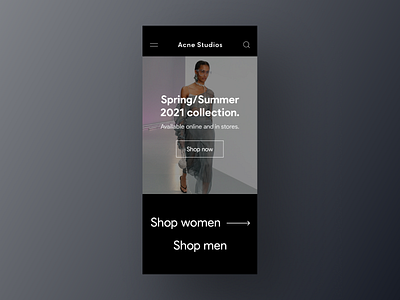
The shot shows three screens. The left one is the woman section catalog, the middle screen is the home page, and the right screen is an item card.
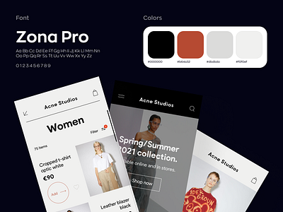
We chose the black and white color scheme adding one chromatic color to match the Scandinavian minimalist approach of the brand.
This concept reflects the minimalism of the brand. In addition to the limited color scheme, we optimized the number of buttons, menu items, and other elements.
What do you think about our vision?


