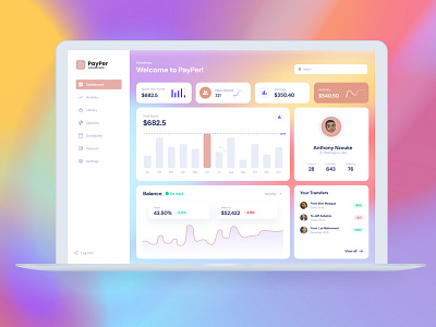
PayPar Dashboard Design
For me, dashboards are one of the most interesting problems of communication design. On one hand, there is data that needs to be communicated and at the other end of the spectrum, there’s a user who is interested in the story.
The entire game is to find an equilibrium between the capacity and limitations of the user, with the information to form a narrative.
Dashboards are not always interesting, so it's important to design an experience that is both aesthetic and functional.
A dashboard is not limited to colorful charts, bold text, and quirky illustrations. It’s a canvas where a story is told.
As designers, it is important to convey key metrics and data in their simplest form to ensure information is conveyed accurately without a user having to undergo a course in data visualization.
Today I worked on a dashboard for a fintech called Payper and I used my knowledge of information architecture to relay data in the dashboard attached.
