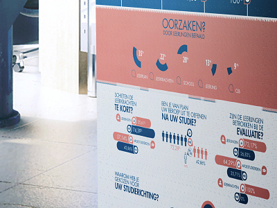
competency banner infographic
A infographic i designed for a student, graduating in high school.
She insist the banner need to be very clean and crisp. fresh colors. only 3 she asked. orange, blue, and i used white space as third color. wich is cheaper for my client.
The banner is in dutch, and is about competence among students.
in the attachment file you can view the original vector file.
More by Robin Merino View profile
Like


