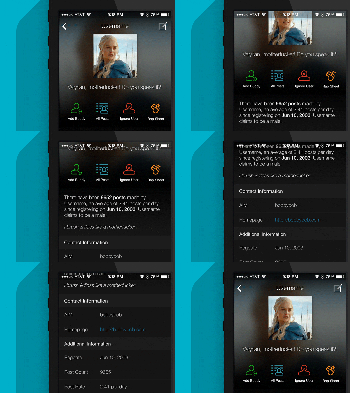
Awful.app User Profile Screen
This is a new profile screen for user's of our app, 'Awful'. The app is basically a mobile version of an old vBulletin layout. Attached you can find a screen of how it looks on desktop, alongside the real pixels.
One Challenge was dealing with the variations of Users with no titles, no avatars, both, or just one. That's why I decided to just go with a single column layout for that.
Also wanted to pull in the most important actions to the top. I've been bouncing back and forth on icon colors. Specifically, should they be colored like that, just be our blue that we use for clickable objects, or be white. Thoughts?
More by David Ridilla View profile
Like


