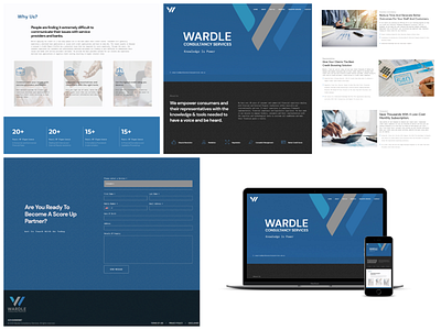
Wardle Consultancy
The site does a brilliant job of showcasing the brand features in a clear and concise manner combining a structured format, clever parallax scrolling effects, neat vertical navigation and load transitions. A conversational approach to what they offer, this one-pager for Wardle Consultancy, a finance consulting firm based out of Australia is a perfect example of “less is more”, with only five sections in the navigation that present the app details, demo link and contact information. Strong color scheme, textured backgrounds and modern typography adds a bit of personality with a gorgeous enquiry form in the footer.
Website: https://wardleconsultancyservices.com.au/
Interested in partnering with us on your next project? Send us a message, and let’s discuss how we can help you. Drop us an email at projects@xclamatory.com if you would like to talk about creating a brand or a digital product.
