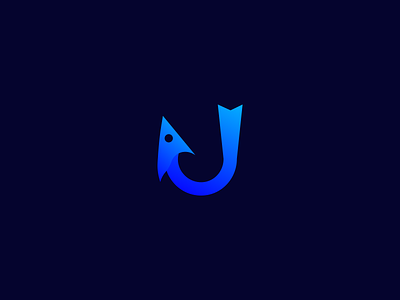
Logo Design: ikado
Hi guys!
I present to you the logo I designed for the ikado company.
The fishing hook producing company will contact me for a minimal and interesting design.
A modern and meaningful icon work by integrating the fish and fishing hook. The hook is bent to form a fish. The back of the fishing line represents the tail of the fish. I saw the blue color transitions because the sector covers marine vehicles. Gradient is appreciated for being friendly and interesting because of the excellence it offers.
Let's talk about what is considered when creating a design;
-To be modern
-Marketing with the industry
-Fish and hook
-Color transitions
-Readable typography
-Assure
The logo design on the 3rd page is an alternative design.
If you like this design I drew, you can press the "L" button 🤩
Need a brand identity design? say hi 👋
-sencanwork@gmail.com


