#Daily UI – Day 004
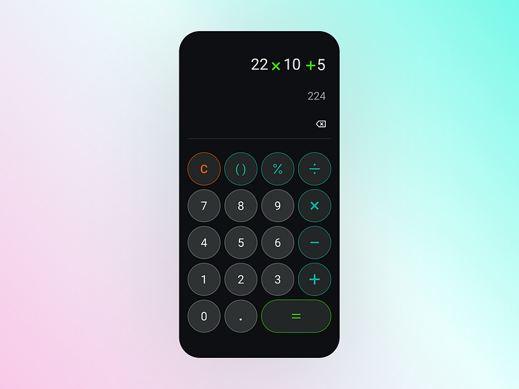
#DailyUI Day 004 – I designed a calculator for android 🤖📱➕
I used a lighter fill on my 0-9 buttons as I believe the user will interact with these buttons the most, so wanted to clear visual difference.
I outlined the remaining buttons in red/orange (clear), teal (add, subtract etc.) and green (finish equation).
Any feedback would be much appreciated! 🙏
#uidesign
More by Michael Donlea View profile
Like
