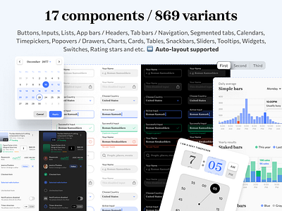
Mobile X for Figma - 17 components made of 869 variants
20 components, 869 variants, 157 mobile app templates
Mobile-X Figma design system is a cross-compatible & stylish UI kit that fits both iOS / Android apps. Based on iOS specs adopted to 8dp grid. Contains a huge collection of hi-end components with Auto-layout, styled into dark & light themes via Variants. Save time on design with predesigned screens included, which you're free to use as it is or remix & modify.
Product highlights:
• 20 components with 869 variants. Buttons, Inputs, Lists, App bars / Headers, Tab bars / Navigation, Segmented tabs, Calendars, Timepickers, Popovers / Drawers, Charts, Cards, Tables, Snackbars, Sliders, Tooltips, Widgets, Switches, Rating stars and etc. ↔ Auto-layout supported.
• 150+ detailed app templates. Cards, Charts, Date & Time, Dashboards, Data grids, Inputs, Drawers, List items, Product details, Player, Popover menus, Settings, Selection, Start screen ✍ Named, Organized, Dark & Light.
• Fits for Android / iOS / web apps. This kit fits any mobile OS. Based on iOS specs adopted for the 8dp Android grid. No more strange 5, 7, 11, etc. paddings. Fits for Flutter development
• Dark & Light themes considered. Use Figma’s Variants to swap components into the night mode. Each template supported by instance restyled into a dark theme. Modify master screen, then detach, if necessary.
