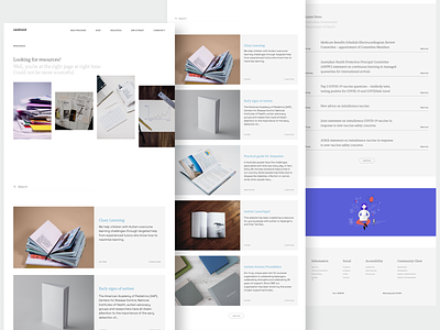
Carehood - Resources
Hello folks,
Here's a new shot of a new page. This is the resources page for the website and it's function is to provide with a list of essential resources that the user might need. Pretty straight forward huh! I had a tough time deciding how I should put the resources in the page so that users finds it informative as well as not intimidating. I mean not at all difficult to understand what the resource is about but also not putting too much to their face. Card component made the most sense to approach it and the card itself has every important information one might need to know before they decide to learn more about it. That was the whole point.
Now, something like that shouldn't have taken a lot of time, right. I was initially trying to come up with a creative solution for that and did spend a lot of time, did so much of brainstorming but there was always something wrong and if there wasn't, the fact that the solution might be a very new concept and the user might get confused as to how they should accept it. This is a very common thing in the creative industry I've heard and myself tackled a lot of situation like this and result to going forward with that only ends up worst and going for a redesign if not rebrand. There are some things that people are used to and they find it easier to digest, changing that disturbs the flow of understanding among people and might also add learning curve, which is obviously a no-go. Will tell more about this in the next post, although I don't think there's much to tell.
Hope you guys like it 👍
If you want to work with me then click that "Hire Me" button duh! 🥳 or if you're looking to connect with me I'm on Twitter 🍕
