Website for a design bureau
Hello everybody!
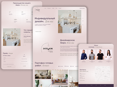
I want to present my work to you: a website for a design bureau that creates an individual design of houses, apartments, studios.
Based on the research of competitors and target audience, I decided to add colors to the site, make it brighter, and not just black and white colors, like other design bureaus.
Beige, pink tones are what I associate with coziness and beauty, so the choice fell on such a palette.
In my site there are two fonts, which in a pair create an interesting look, the text is also selected in the correct size, for people who have poor eyesight there will be no problem.
Regarding the logo, I tried to think over something that would be different from others, to avoid standard “houses”.
Everything is conveniently located on the site, a logical sequence of blocks, everything is simple and clear.
Thanks for attention! :))
