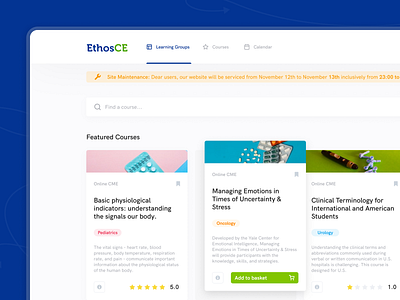
EthosCE Medical Educational Platform - Dashboard
😎Hey guys!
Today we’ll show you one of the most important parts of this project, the core of EthosCE and what makes it stand out among competitors.
🔫 Dashboard
It is the main screen that students will interact with. In this case, we dedicated our efforts to make it easier for users to find any new preferable courses and to look up any information on courses that they are taking at the moment. Moreover, here they can track their tasks, grades, ratings and many other details connected to their education and professional development.
🗜 White Label
It’s a secondary nevertheless important function of the platform. A workspace for education facilities and independent tutors where you can present your own courses. Your flexible page will have the brand style of EthosCe and your logo. Also, you can arrange the structure of information blocks to your liking to better fit your vision of a course page. This will help you promote and sell your lections, courses and educational materials.
---
💌 We are glow Agency
We help companies design efficient digital products. We also design web & mobile apps from sketch to launch, improving them over time. Our mission is to bring our clients’ products to a whole new level by solving real problems and reaching business goals.
Check Full project at glow.team
Follow us below:
Clutch / Facebook / Instagram / Behance / Medium / LinkedIn
More screens are coming soon.
But for now share some love with Glow, press ‘L’ ❤️


