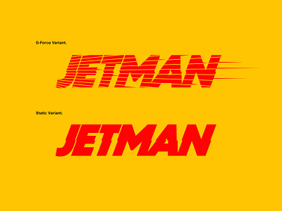
Jetman Logo Design
Jetman had his own 30-issue series running from 1946 to 1951 however, he never had a story of his own... His only ‘power’ was flight by the use of a jetpack which in an age full of cosmic surfing, planet annihilating behemoths, is actually quite refreshing.
I was approached in early 2021 to come up with concepts for a reboot. The old logo has tons of charm but needed to be brought a little more up to date, however, the original logo design deserved respect, so subtle touches were crafted into the new logo concept as a nod to its heritage.
The typeface is similar, yet slightly more robust. By re-introducing the offset horizontal aspect, the new logo gains some of its original charm, by tightening up tight tracking the logo feels a lot more compact and modern. Two variants on the logo were designed to identify with Jetmans abilities of flight, we call these the static variant and the G-force variant.